Live Abroad - Brand/Hand Drawn Typography
The Brief
Live Abroad is a discussion forum site that discusses all things to do with woking and relocating to a new destination. As part of the brief the challenge was to come up with something that referenced the idea of coming home, that sense of belonging and familiarity, while updating the current logo of the site, which has been online since 1999! The brand refresh is part of an ongoing refresh of the site.
The Solution
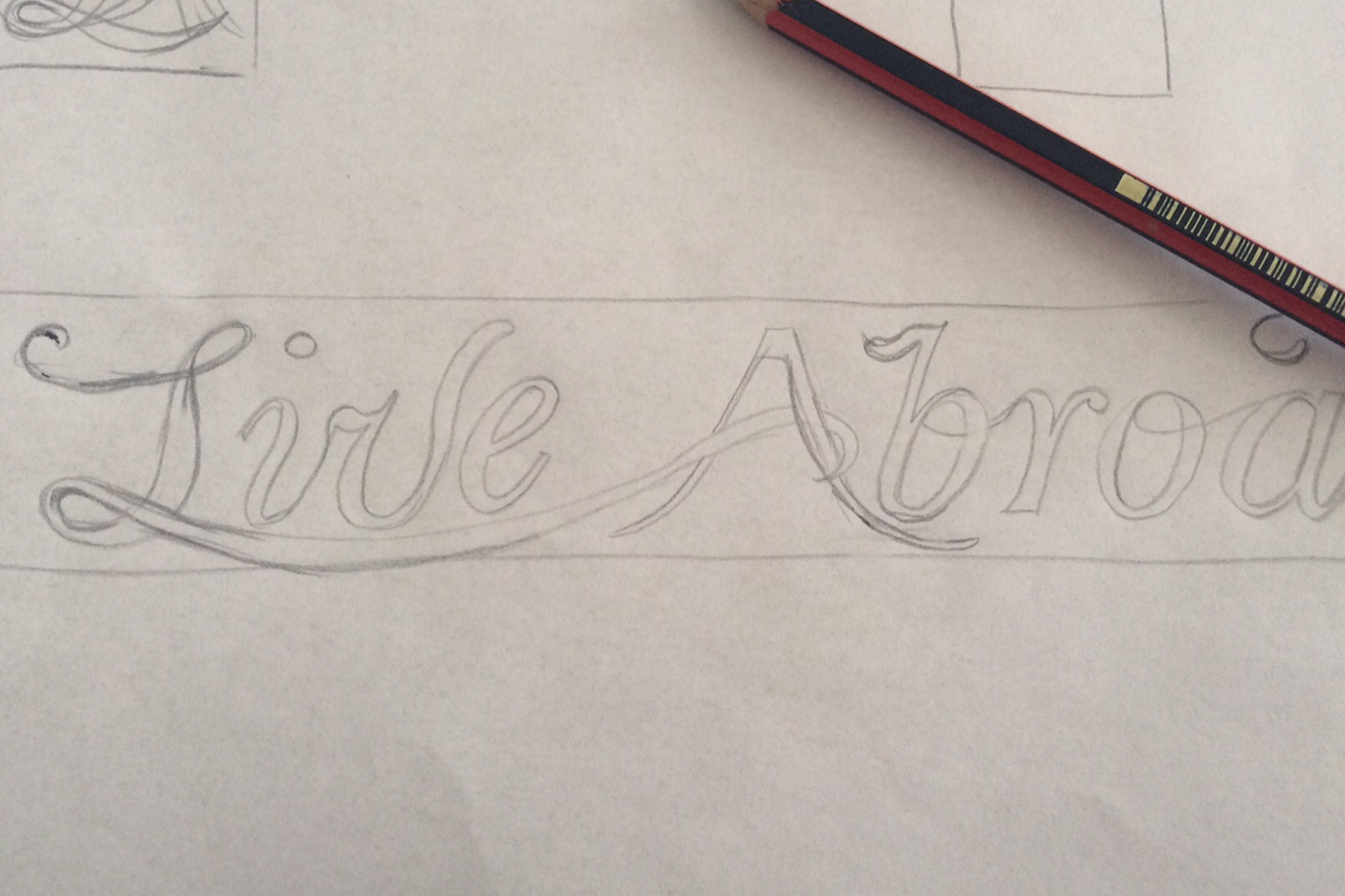
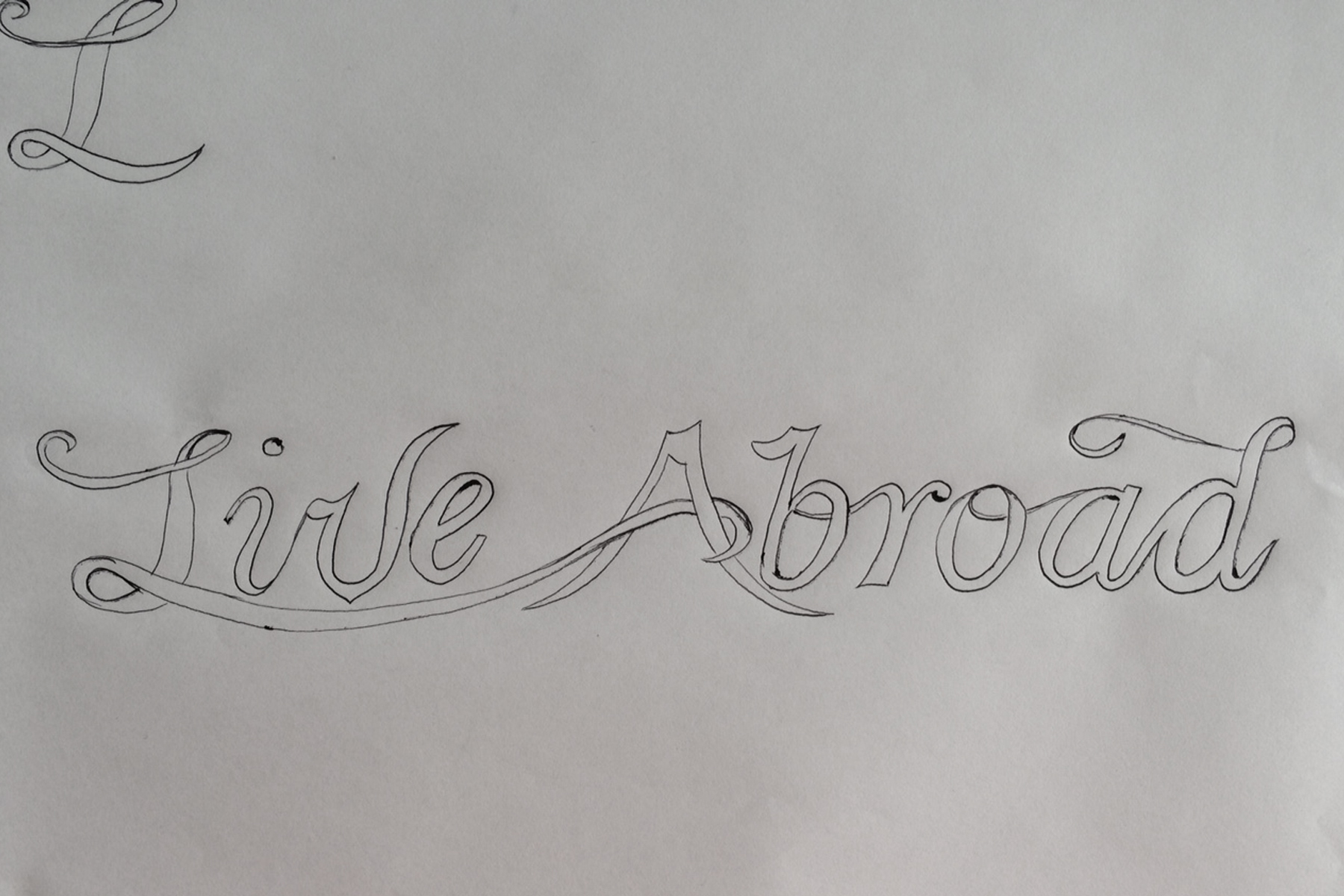
The identity was crafted by hand, starting with investigating letterforms I then combined these to form a fluid line that is representative of the many journeys taken before finding a destination. Each character drawn and redrawn until rhythm and pace was created. The resulting final logo was then digitized in Illustrator and shading was added to give the impression of depth in the looping swashes of the typeface.


